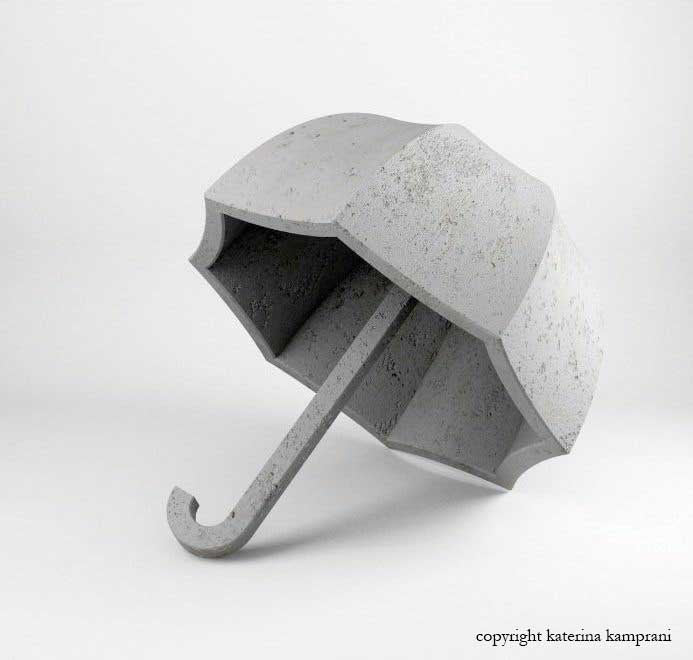
Bad Design/Good Design
Greek designer Katerina Kamprani specializes in bad design. At first glance, her works seem to be primarily whimsical and aimed at generating chuckles. Toeless galoshes, anyone? However, to write them off as completely frivolous misses the point. Sometimes, we don't realize what makes for good design until we see it juxtaposed with the bad. For instance, take a look at Kamprani's wine glass.

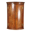
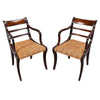
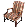
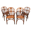
The lines are graceful and the form is certainly attractive, but when one imagines trying to take a drink, the whole thing falls apart. Side-by-side comparisons are also useful in judging the quality of certain antiques. Just because something is old, doesn't mean it was designed (or built) well. There was certainly much trial and error in the evolution of certain forms that persist to this day. The unsung furniture makers of our past must have had to create many pieces that didn't work to arrive at those that did. It is a fun and informative exercise today to look back and try to re-imagine what some of those failures might have been.


