


News

Return to Sender
Think back to May 2019. It seems a lifetime ago, but I think more than a few of us would love to time-warp back to that moment. No one had ever heard of COVID-19. News outlets were cooing over the birth of Prince Archie. In our trade, the antique show circuit was rolling along as always. In preparation for the Merchandise Mart show in Chicago, we were mailing tickets to our clients in the area. Well, fast forward to the present. We were reminded of that simpler time and all the water that has passed under the bridge since when we receive the letter pictured above in our mailbox.

Check out that postmark! May 2019! This letter was just returned to us after 14 months in postal purgatory! We must apologize to the intended recipient who never received their complimentary ticket to the show. You missed a beautiful event.
We must say we love the USPS. The typical service provided is remarkable value. However, at times, it can be just a little too easy to poke a little fun. The imagination runs wild trying to picture what this poor little letter must have gone through over the past year.
We hope all our clients and colleagues are staying safe and healthy out there. Until we meet again....
18th Century Seats for 21st Century Butts
Christine Coulson draws on her 25-year career at the Met for her new book Metropolitan Stories. An excerpt that can be found in a recent NPR story is told from the perspective of an 18th Century fauteil. The dent in the original fabric created by "an 18th Century butt" serves as a jumping off point for Coulson's imagination. As a "museum piece," the chair no longer fulfills its original purpose: to support butts. In the linked excerpt, the chair wistfully yearns for anyone (!) to come sit and give its life meaning once again. While we here at JTA certainly understand the desire to preserve the original upholstery on such a special piece, we also realize that chairs were built to be sat in. It can be a fun exercise to sit in a 300 year-old chair and let the imagination run wild with thoughts of who else's seat might have graced that seat over the course of centuries.
We currently have a large selection of seating still able to accommodate the backsides of the 21st Century. Click on the link below to see a wide variety of stools, sofas, settles, settees, Windsors, wing chairs, side chairs, ottomans, and on and on. Take a look and feel free to plop down in any of these (but do so respectfully, please!).

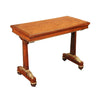
The Morning Commute
Make Me a Meme
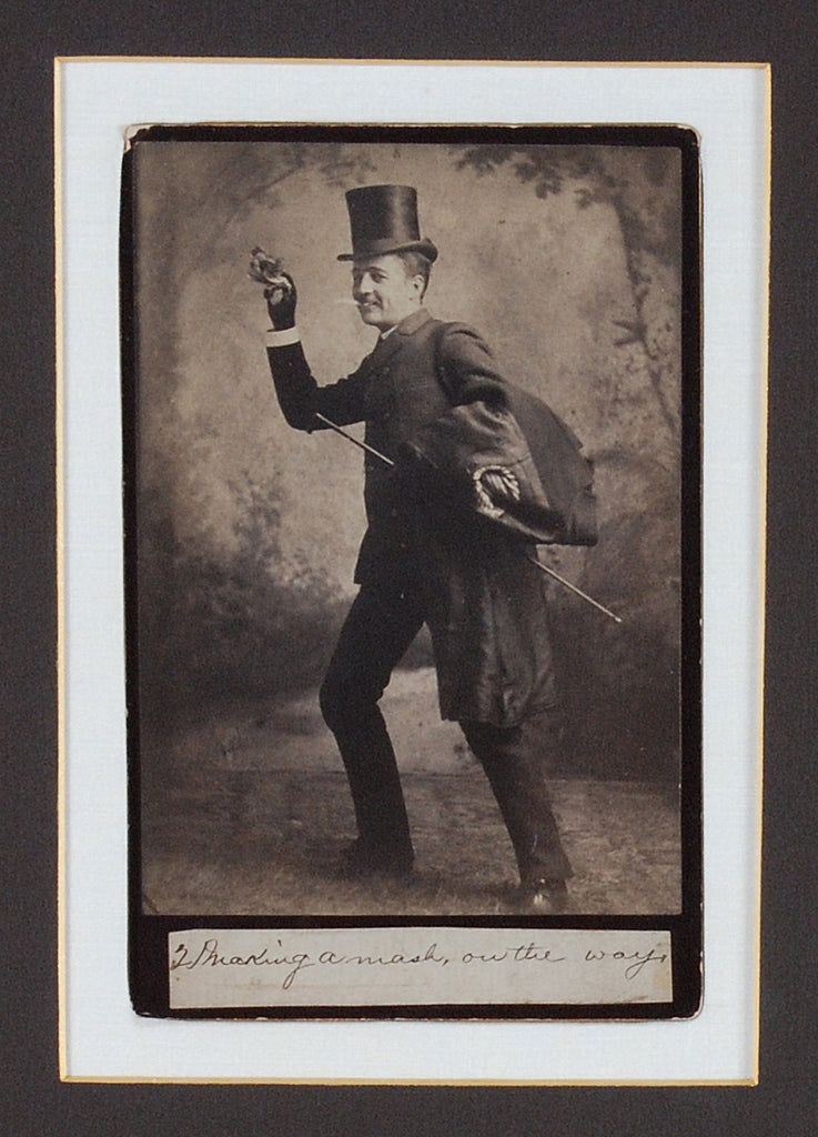
This series of cabinet cards from the late 19th Century seems to have a very modern sensibility about them. The images depict the progression of a night on the town with the fellas, and some of them feel like social media selfies in black and white. Take the image shown above, for instance. The silliness of the pose creates a dissonance with the formal attire and conventional backdrop. This guy is screaming to be made into a meme, much like Joseph Ducreaux's Self-portrait of the artist in the guise of a mocker. One example of how the modern meme-maker handles Ducreux is this:

But a simple Google search will turn up tons more (some safer for work than others). I think our teetotaler in the top hat is also ripe to become an internet celebrity at least a century after his time. Feel free to dive in, edit, and share away.
But seriously, we think a little bit of humor is essential in any living space. We always try to bring a little mood lightener to any show booth or interior that we have a hand in. And while Ducreux is secured away in the Louvre, our gent having a good time in these photos is available to bring a little whimsy to your home.

The Dog Days Come Early
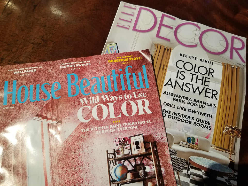
Noticing a (Color) Pattern
The Monday morning mail run was never so exciting. Awaiting us in the post box this morning were two separate design magazines extolling the virtue of COLOR (!!!) on their covers. The return of color has been a growing theme over the past couple years. However, we at Jayne Thompson's have never discriminated. We've always embraced colors across the spectrum and will continue to do so whether it's trendy or not.
Cases in point:
The green fabric walls we employed for our St. Patty's day booth in Charleston this weekend:

Two-tone contrasting walls at last year's San Francisco Fall Antiques Show:

Color, color, and more color for a recent design job at The Still at AMBRAbev:

Lori incorporated lots of blue and green into this recent residential design project:

An 18th Century mahogany wing chair upholstered in a Lee Jofa block-printed floral linen:

Some more colorful upholstery:

Incorporating the flower photography of Paul Lange brings strong focal points of color to the walls:

Using Oriental carpets to bring color to the floor:

And don't forget the ceramics:


Things We Love 2
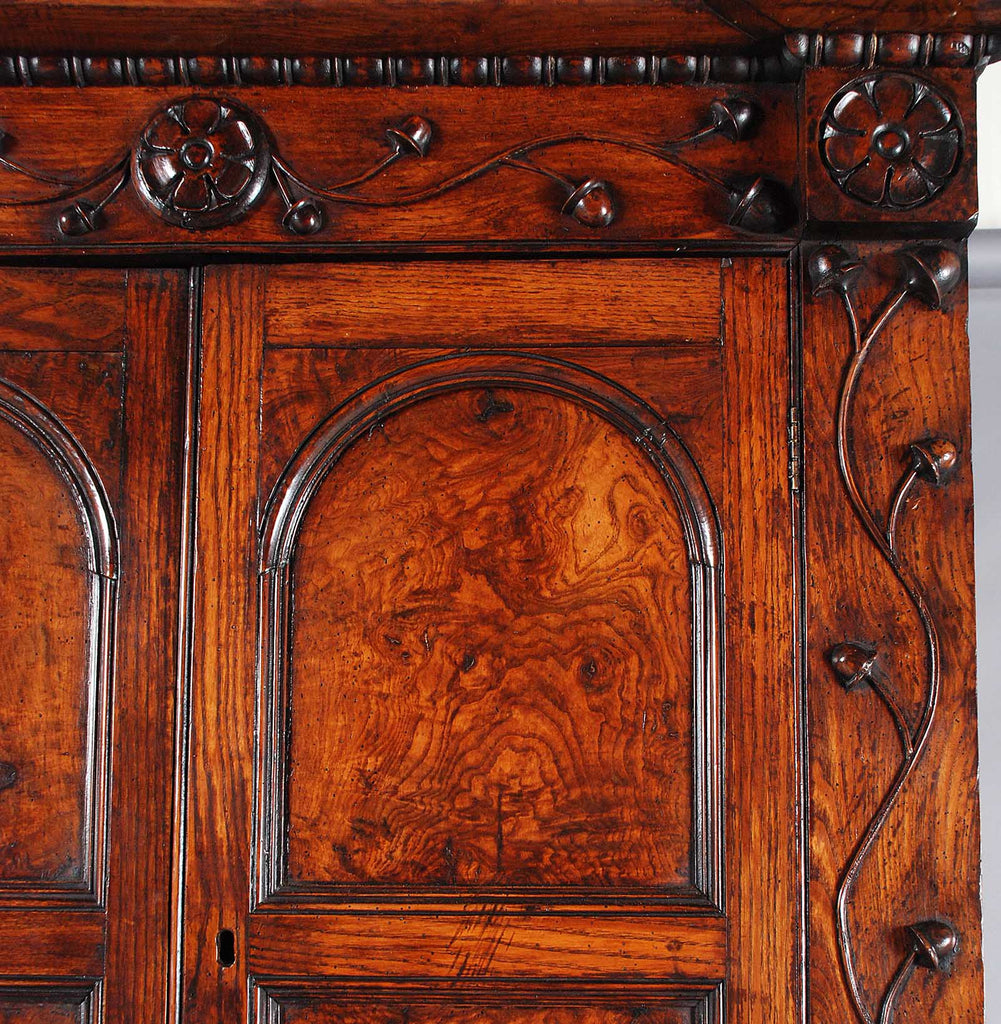
Any antique dealer will tell you the two most exciting parts of the job are discovering a gem to buy and finding one of those gems a home (i.e. SELLING!). After decades in the trade and thousands of finds, the first part of that equation comes naturally. A certain piece will captivate us almost immediately. While it can seem an entirely subjective phenomenon, there are definite criteria that always come into play. Those criteria are illustrated beautifully in this recently acquired corner cabinet and a few of them are as follows:

FORM: The first feature of a piece to note is the overall form, much like you would initially take in the composition of a painting. We are constantly seeking out forms that stand out in some way or many ways. While the general form of this corner cabinet (2 doors over 2 doors) is nothing unusual, there is quite a bit in the details that is. Most obvious of those is the scrolling vine motif and the buds? the acorns? the rosehips? that are growing on them. Whether these are meant to be a stylistic representation of some real-life plant or a figment of the creator's imagination is beside the point. In fact, the mystery is part of the fun. The motif, however, does serve to fill the rails of the cabinet carcass with a visually pleasing stimulus. The undulating, organic nature of the vines serves to break up the inherently boxy nature of the cabinet, and is echoed in the arched panels of the upper doors and the floral medallions below the cornice. Some other nice details which also break up the "straight line" shape are the turned split moldings just below the cornice and on the interior shelf front, the half-round pilasters of the lower section, and the roundels above those pilasters.

PROPORTIONS: Walking hand-in-hand with Form is Proportions. In the case of this particular piece, we love the slender proportions. In addition to its advantages in terms of commercial considerations (i.e. finding a corner wide enough to place it), the narrowness gives this piece a vertical quality, again lessening the sense of "boxiness" (not that there's anything wrong with that). We also love the low-waisted proportions of this piece. Typically, we look for pieces with a 1/3-2/3 relationship between the lower section and upper. While this one doesn't quite hit that mark, the waist does is significantly below the halfway point, which avoids the "Mom Jeans" vibe of other high-waisted pieces (not that there's anything wrong with Mom Jeans).
COLOR/PATINA: While these two traits go hand-in-hand (much like form and proportions), they aren't interchangeable. Color can be described as the underlying hue while patina refers to the accumulated surface on top which consists of decades of dirt, grime, ash, and wax. In the case of this piece and any piece with outstanding color, the term "colors" might be a better term. This piece ranges from a deep auburn (without getting TOO red) to a mellow caramel. All these various tones, the result of sunlight hitting the piece in different areas, retain a richness, a warmth and a mellowness. Atop these lovely colors, the patina is most prevalent in the nooks and crannies of the moldings, the carving, and the knots of the wood. There is a dark crustiness built up there that adds further nuance and drama to the underlying color.

TIMBER: The fact that this corner cabinet is made of elm (or it actually could be a highly figured ash) sets it apart from the more typical varieties which come in pine, oak, or mahogany. Whether or not the casual observer could identify the wood species, they could easily appreciate the exuberance of the figuring in the grain.
AUTHENTICITY: This piece wears its age on its sleeve, and we mean that in a good way. The panels have warped in such a way that gives them a bowed appearance and feel, just as you'd expect for a piece of wood with so much movement to the grain. There is evidence of dormant woodworm. There are also several "honest" repairs. For us, authenticity doesn't mean that a piece is devoid of any repairs. Sometimes a piece that is too pristine makes you wonder if it is too good to be true. For instance, we have had to replace the plinth of this piece. As it likely sat on a damp floor for much of its life, the existing plinth was in such a state of rot that it wasn't serving its function of supporting the case. Now that the repair has been made, the piece should stand up to a couple more centuries of use just nicely.
If you've read all these many words to the bitter end, we thank you. We imagine if comments were allowed, we'd get several TL;DR's. But if you did stick it out, we hope you appreciated a little bit of insight into our process. We don't necessarily tick all these boxes in mechanical fashion, but they are always in the back of our mind. In short, these are all just a bunch of words that boil down to: "We think this is a beautiful and interesting piece, and we'd love for you to have it."
Happy Thanksgiving!

Heading West
Things We Love 1
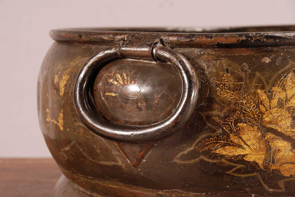
One of the more more subtle pieces we've acquired recently has inspired us to start a new blog series titled "Things We Love." This chinoiserie wine cooler absolutely captivates us. At a glance, you might dismiss it as an old beat-up piece of metal. If you spend time to take a closer look, you might discover the beauty that lies in its imperfections. I guess our description of this piece as "untouched" isn't entirely accurate. It surely has been touched by the hands of time. Its 300 years of age is written into the dents and bruises and loss of decoration. These imperfections evince the age of the piece. When you pick it up, you are immediately aware that you're holding a piece of history. I imagine it to be something like the feeling an archaeologist gets when uncovering an ancient artifact such as a shard of pottery that has been buried for centuries.

And while we do appreciate what's missing, what remains is equally intriguing. The faint traces of a red, possibly faux-tortoise shell ground; the sparkling nature of the gold floral painting; the crusty boundaries between the paint and the bare, patinated metal. All these details spark the imagination: what might this have looked like originally, who might have taken the time to create such a thing of beauty, and what tales has it overheard as dinner guests downed bottles of wine pulled from its interior.

Of course, we could find someone who could re-paint this piece. We could re-create what it looked like the day it was made without the use of imagination. But we feel that would rob it of its character. It would be akin to putting arms back on the Venus de Milo. A fully intact Venus would rob her of her mystery. There would be no room for speculation or imagination. She would be what she is and nothing more. It is her imperfection that makes her perfectly beauty. And while this wine cooler certainly doesn't reach the level of cultural significance of the Venus de Milo, we find it to be gorgeous and full of character for some of the same reasons.